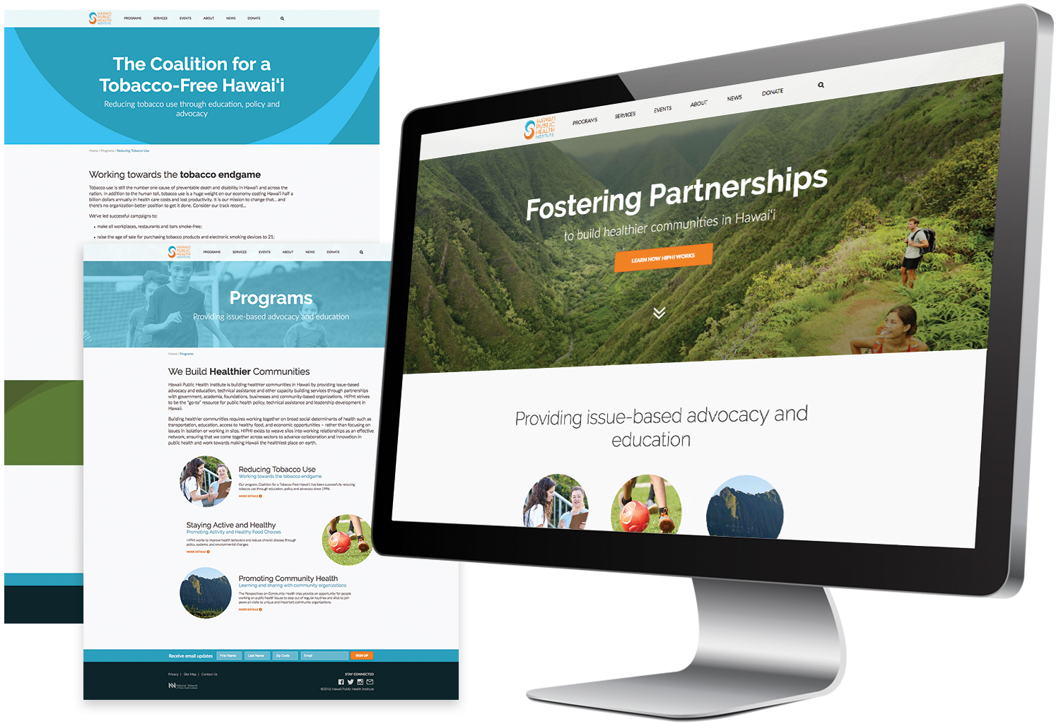
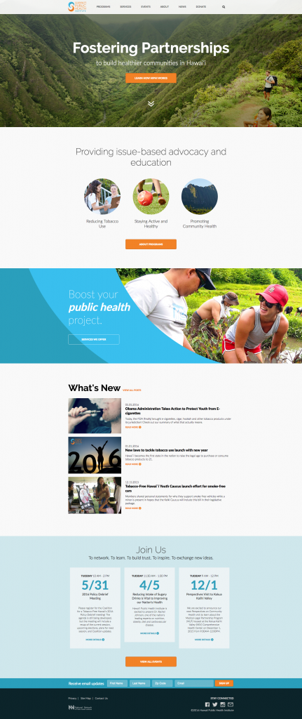
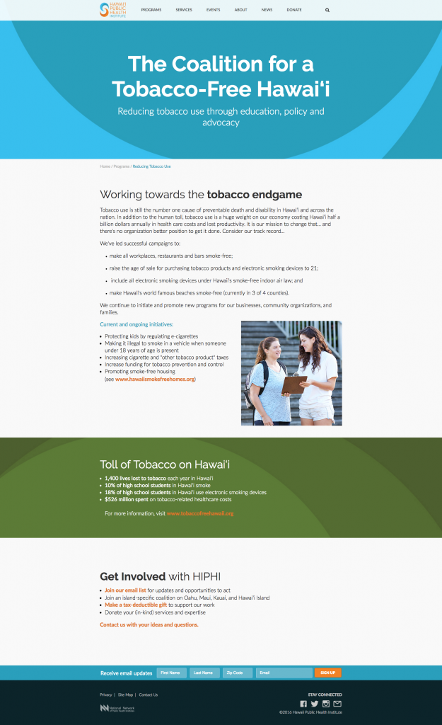
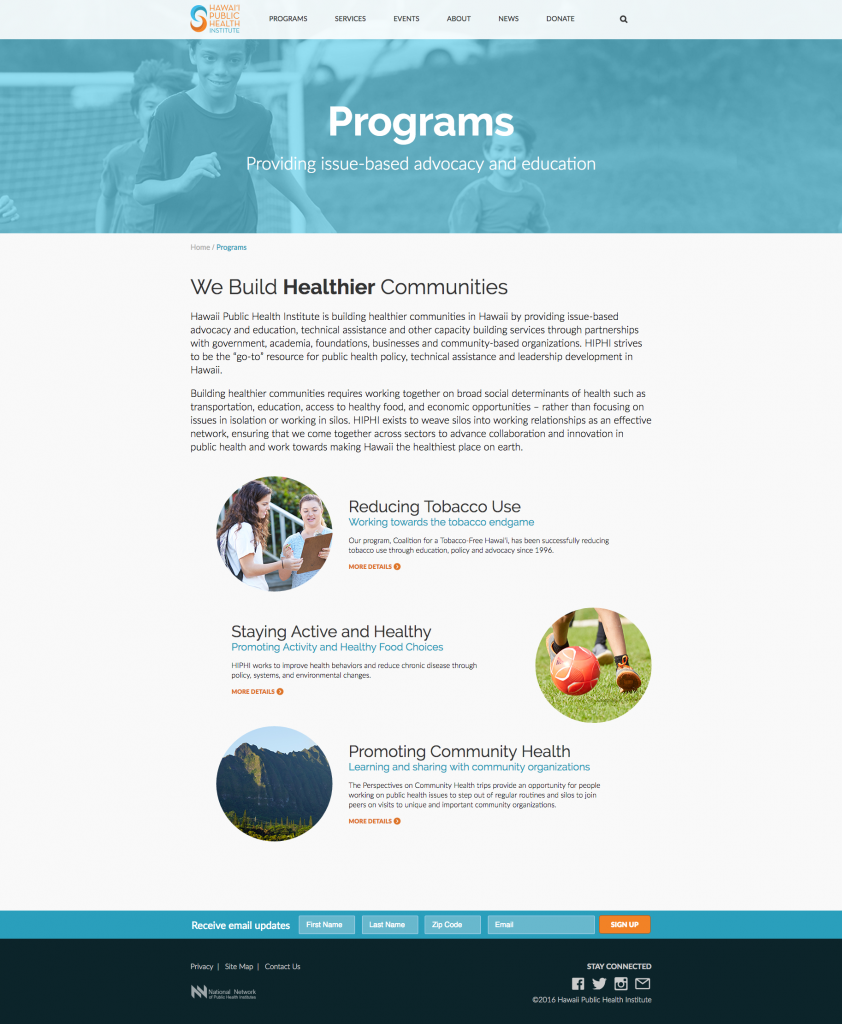
During my first year working at Anthology, I was able to put my web skills to the test with the task of redesigning the Hawaii Public Health Institute website. This turned out to be an enjoyable project for me.
First, HIPHI had fun yet grounded brand colors. A warm orange paired with an energizing, electric blue – to which we were happy to introduce to their earthy counter part, green. We felt that together, these colors would be able to convey a sense of positive action. Like hype colors to get you stoked about the health of Hawaii.
Second, HIPHI had access to just the right amount of photos. BOOM. Photos are a designers dream, let me tell you that. No stock photography was used in this redesign. And that is something to be proud of.
Third – and still better – the freedom to choose fonts. In this layout we are using all google fonts – “Raleway” and “Lato”. These are perfect for a pinch of style and a handful of stability.
Fourth still, this was a personal favorite because it was the first time I got to work directly with our dev team at Anthology. Alongside learning how a front-end build is integrated to a content management system, I took note of certain problem areas of design and some of the inconveniences we should try to avoid in order to smooth out our execution of projects. It was overall a positive experience that helped encourage me to expand my working circle.