I built the Color Contrast Checker while I as doing website redesigns when Web Accessibility became relevant. A lot of brands were having to update or completely redesign their sites due to Accessibility requirements. While working through layouts, I found myself having to go to the WCAG color contrast checker online tool to check each color combo one by one. And then, to remember those combinations and which ones passed the contrasts requirements was a nightmare.
The first thing I did was Google search “Color contrast tool”. And yes, there are a good number of tools out there, but each of these tools, didn’t allow me to check a whole palette at once. I would have to check each combo individually.
After about 20 minutes of no success – I remembered that I can code. So, I started to build my own tool that did exactly what I wanted.
What did I want?
- I wanted to be able to check an entire color palette at once
- I wanted to be able to save my results and easily reference them later
Setting the stage:
- The intended user for this tool is a designer who is testing and adjusting an existing color palette rather than creating one
- The tool is to be used while a designer is currently using a layout program – for example Adobe Photoshop.
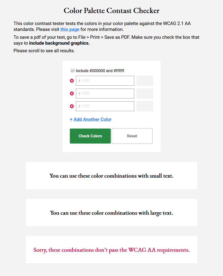
Prototype v1
This is the first prototype that I built was a trial run. It is not at all pretty and it didn’t have the most friendly user experience but it allowed me to click and fine-tune what I wanted the end experience to be. If you visit Prototype 1, you’ll see what I mean.
For one, if you spam the “Check Color” button, your results accumulate on the bottom of the page. This is both overwhelming and annoying, because now you have to scroll up and down to look at your results.
Another thing I didn’t like about it was that when you click reset the WHOLE page refreshes. Meaning you have to start all over again. What if you just wanted to clear the results and adjust one or two colors?
Prototype v2
After I had a better handle on the use cases I wanted to design for, I moved on to my second prototype. A few of things I had in mind were:
- Update the layout so that the user wouldn’t have to scroll as much and could reference their colors and results at the same time
- Add the ability to clear just the results
- Add the ability to clear just the color inputs
- Do not let the results accumulate each time “Check Colors” is clicked
- Allow user to “download” their results – with Print > Save as PDF
- Can easily copy paste next codes to/from the checker tool to the design program – no need to worry about “#“
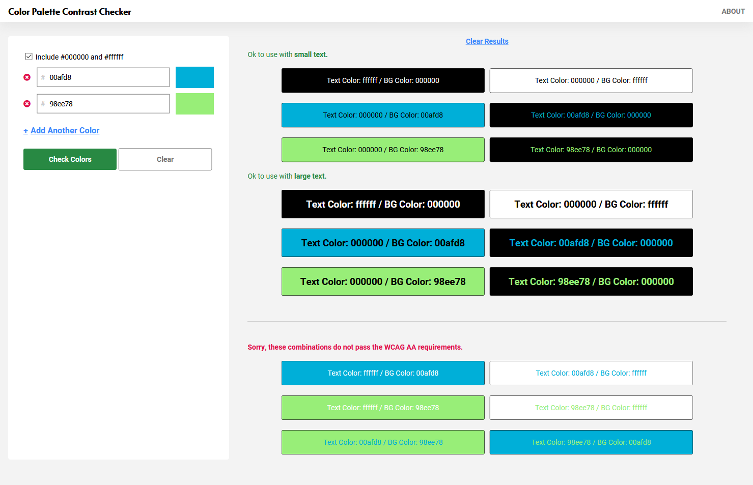
Here is is Prototype 2!
Much more efficient use of space, and more control over resetting and clearing the tool. Now I’ve got a tool where I can test all my colors at one time, and see and save my results.
Prototype 3
But let’s not stop there. There are always things to improve. When I have the time to continue this project, here’s a few things I’d like to adjust to improve the UX even further:
- Add a button to download a nicely laid out version of the results
- Instead of relying on Print > Save as PDF
- Make labels more succinct, for example remove “Text” in all the color blocks. That way I can probably fit more boxes in the space before having to scroll
- Add validation messages to the color inputs
- Currently, you’ll see an error if you input a wrong color but there is no message as to why
- While this should be intuitive to designers… it would just be a nice touch to make the tool use-able for those who are not designers
- Add more uses to the tool:
- Add a color picker to the color inputs so that if you need to design or adjust here you can
I was quite happy with the results and I use my tool all the time while do layouts or even picking colors while coding web pages or screen elements.