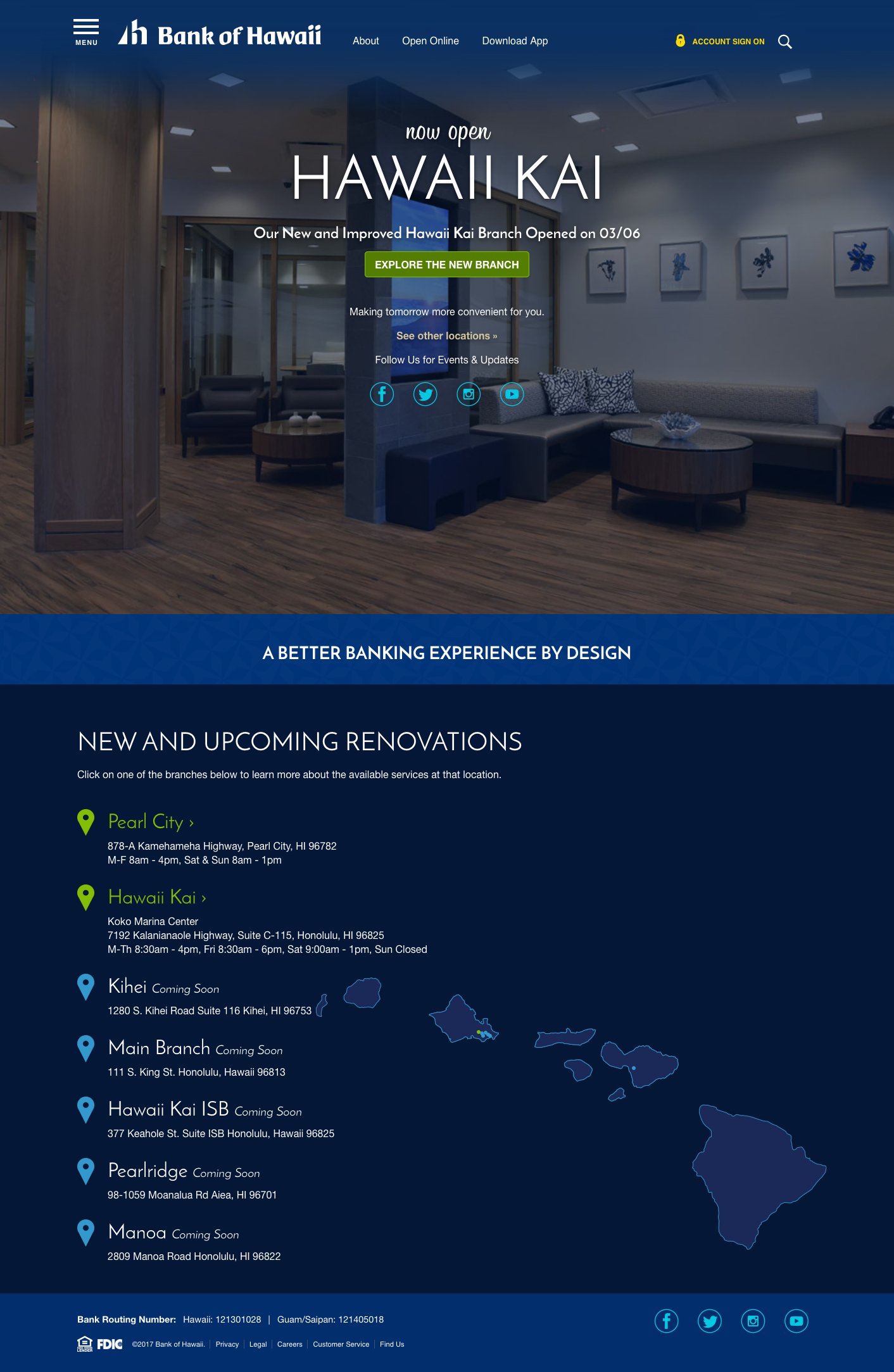
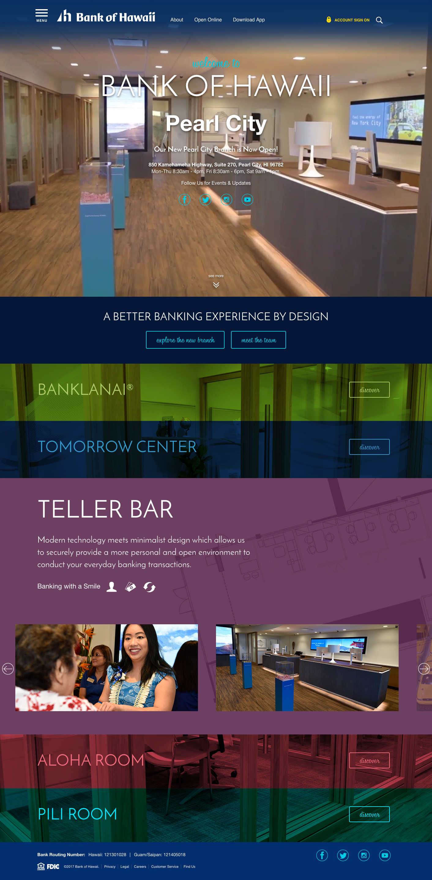
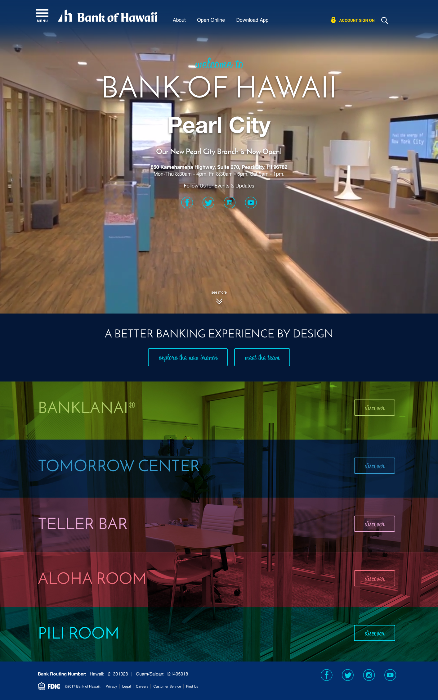
To celebrate the renovations of certain the Bank of Hawaii branches, Anthology worked with BoH to create a landing page to highlight the new features of the branch. Each new section of the brach was branded with a new name to supplement the concept of a self service branch – the purpose landing page was to help people understand this new approach to banking.
In addition to educating bank customers, we as designers were asked tasked with creating a look that was sister to the BoH original branding while at the same time compliment the modern renovations of the new branches – basically traditional but also new. On top of that we were supplied with minimal photographs of the new branches and a simple line drawn map of the layout.
Solution: To create the feeling of new, I utilized micro-interactions with clean lines, minimal photography an updated font for the landing page and combined them with BoH’s traditional color palette.
Layouts ended up as follows. View the Live Page


